PROJECT DESCRIPTION
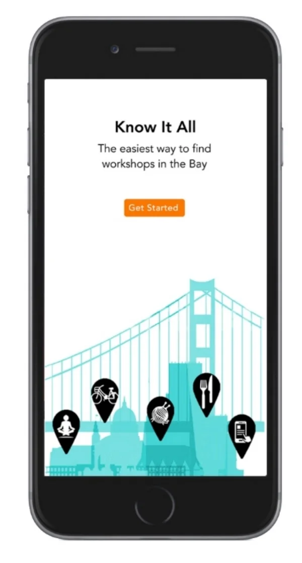
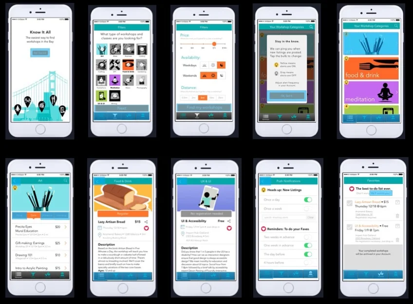
Know It All is a mobile app that I conceived of and designed to take the frustration out of finding workshops and classes in the Bay Area.
Users can either browse through all available in-person learning opportunities, or set up their preferences and let them app notify them when something that fits their criteria is added. Users can also choose to follow a certain hashtag to be alerted when a course matching that hashtag is listed in the app.
When a class is saved to Favorites, the app converts the Favorites list into a To-Do list that helps the user remember to go to that class. And when a class is checked off, the user's accomplishments are archived for future reference.
USERS
Adults in the Bay Area who want onsite, in-person classes, workshops, lectures and other recreational learning events
DELIVERABLES
- Concept & Ideation
- Market Research & Competitive Analysis
- User Research (Online survey plus 1:1 interviews)
- Personas
- Information Architecture & Navigation
- Wireframes
- Visual Design
- Usability Testing
- Interactive Prototype
- Promotional Video
PROJECT TIMELINE
12 weeks
During these 12 weeks, I completed the entire product lifecycle from initial concept, to the iterative UX workflow, to final UI design and user testing.
TOOLS USED
OmniGraffle, Google Forms, LucidChart, Pop, Proto.io, Marvel, InVision, Camtasia
UX Award
Because I completed this project as part of a UX certificate program at General Assembly (San Francisco campus), it was eligible for entry in the student category at the 2015 International UX Awards, where it went on to win the Honorable Mention. The 2015 International UX Awards were held at Parsons New School for Design in New York City.
“Wow. I totally wish this app existed so I could start using it right away.”
— Tikva Morowati, Google
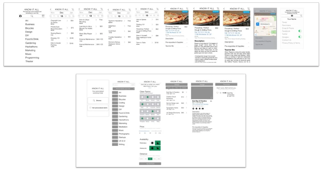
Interactive prototype for my app's design and interaction. App name: Know It All • Project timeline from start to finish: Sept - Dec 2014
(Music by the amazing Batsauce)
The Backstory
There’s a remarkable number of amazing learning opportunities in the Bay Area. Searching for them can be time-consuming and missing out is frustrating. The apps and websites that exist overwhelm users with irrelevant listings, aren’t customizable enough, and lack the alerts that busy users need. My goal was to make finding workshops and classes fast, easy and fun while giving users an experience of relief, gratitude and fun.

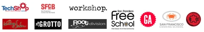
Industry Research
The top 10 workshop venues (according to Google) in San Francisco are collectively reaching over 54,000 users. If each of those users only spends $100/year on workshops and classes, that’s $5.4 Million in revenue. And there’s a lot more than just 10 venues for workshops and classes in the bay. Bay Area residents also spend twice the national average every year on education: $1,130/yr is the national average, $1,961/yr is the Bay Area average*. At that rate, just a quarter of the people in San Francisco alone are collectively spending $392 Million on education each year.
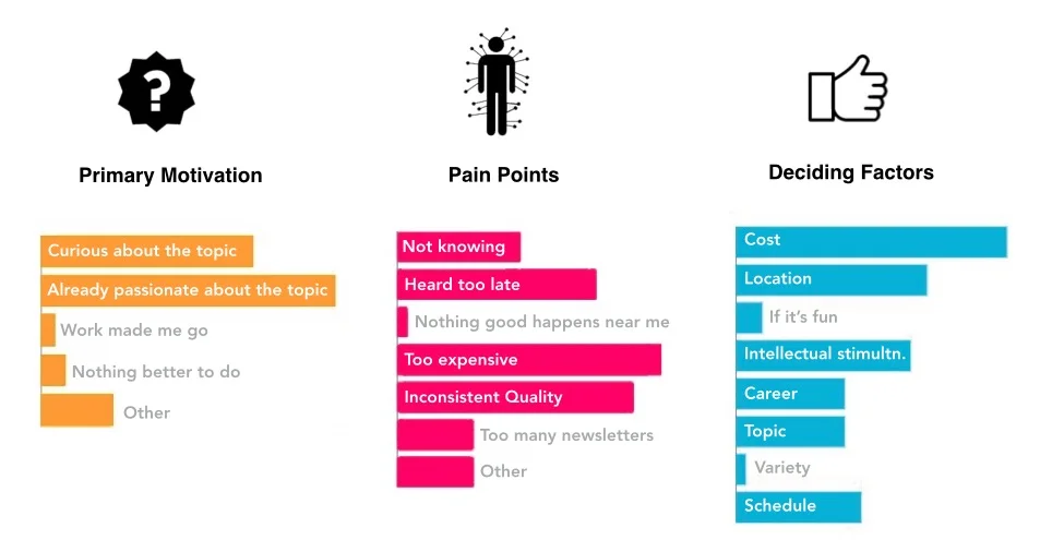
User Research
I met face-to-face for in-person interviews with 9 representative users who identified as makers, doers, crafters, lifelong learners, workshop hosts, and workshop facilitators. I also facilitated an online survey that had over 50 respondents.

Key Findings
Interestingly, but not surprisingly, the factors that resonated as deciding factors for attending a class were often the same or related to users' pain points. Another cool discovery: the group's workshop interest was split nearly 50/50 between business and pleasure.
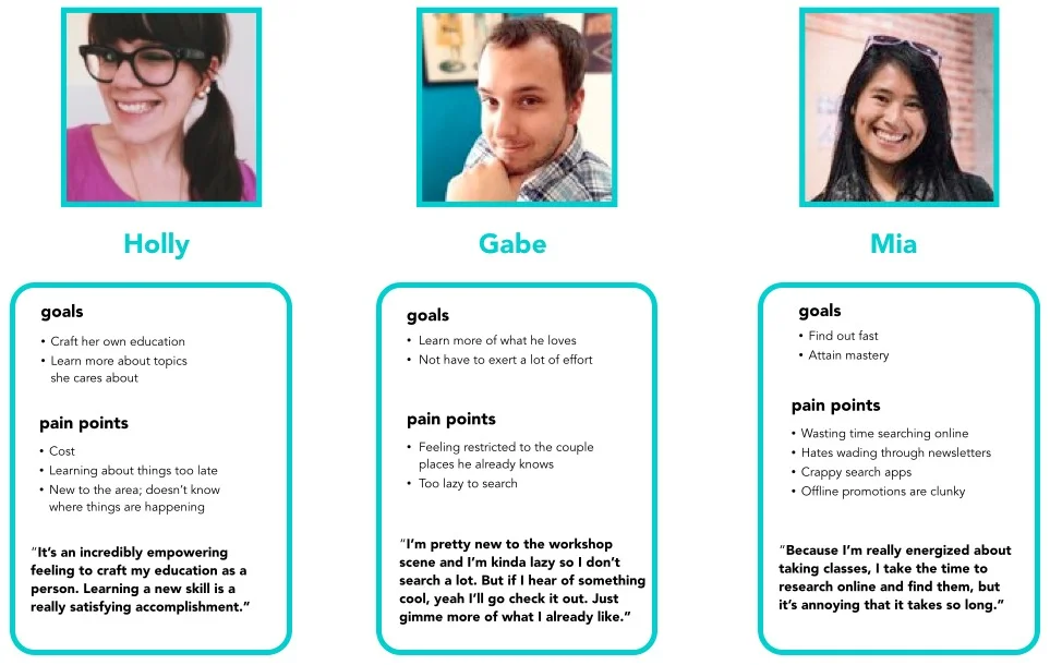
Personas
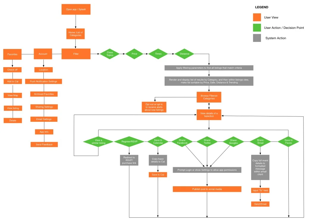
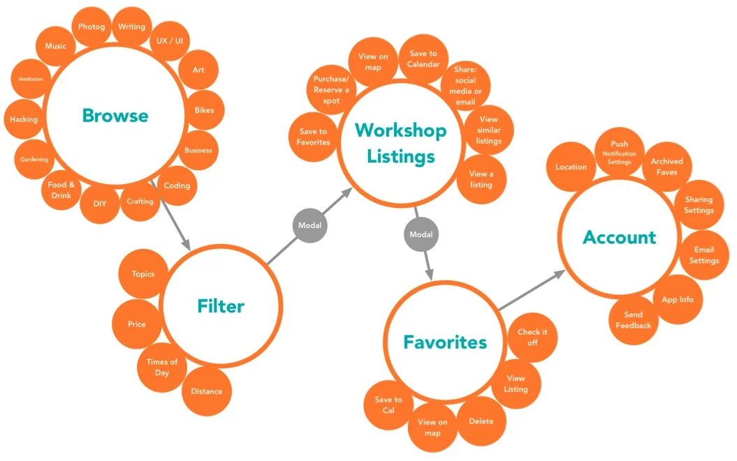
User Flow & App Mapp
Sketches & Wireframes
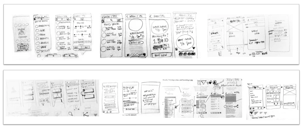
I created 5 different versions of clickable wireframes, all of which were user-tested to discover their strengths and weaknesses.
At the earliest stages, I learned that I really needed to simplify the filtering, browse, search and sorting functions.
My goal was to distill maximum functionality into the minimum number of screens to keep things moving quickly and not waste a single second of the user’s time.
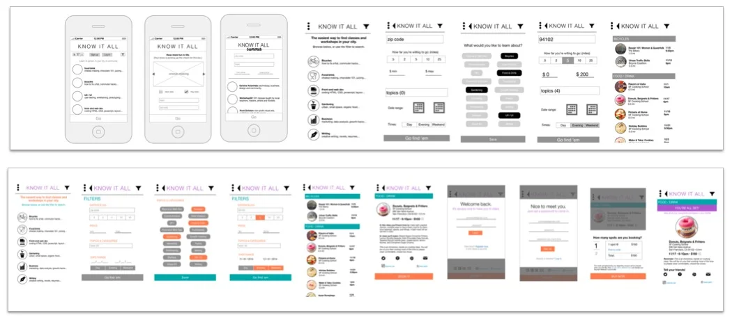
Mood Board, UI Design & Prototyping
Mood Board
Usability Testing & User Feedback
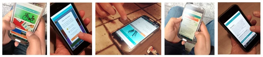
The final round of user testing was a great success due to the many rounds of iteration testing that occurred at the wireframe and rough prototype stage. But as always, I'm intrigued by the surprising things that users say.
One of the biggest surprises during this final round of usability testing, was that a couple of users instantly asked if this was an app to help them meet new people, or even to arrange dates with. I knew from my research that building creative community was a big draw for many active workshop goers, but a mashup workshop+dating app? That was something I hadn't considered...yet ;)
USER QUOTES:
I like that everything I need to know is right here and that it recommends other things I might be into.
This is legit. Can I use this? Like, can I download this right now?
Oh gosh, that's so funny, we were JUST talking about this today! We both just moved to the Bay Area and were trying to find classes to take.
Is this a dating app? I'm imagining all the cool people I could meet this way.
I love that all the information is in one place.
Conclusions & Outcomes
“Wow. I totally wish this app existed so I could start using it right away.”
— Tikva Morowati, UX Lead at Google
“I literally spent went through my email and unsubscribed from all the different Meetup and event news-letters in my inbox yesterday because it’s just so much rubbish. I would love to use the app you’ve designed.”
— Ian Bach, Method Design
Although I decided not to follow through with launching the app as a startup, the feedback I got was incredibly supportive and validated my hypothesis: that users are craving a simpler way to learn about classes and workshops in their local area. To solve that problem, I utilized the best features of hook/trigger design, passive search, and playful reminders to design a product that can solve one of the most frustrating aspects of recreational learning: the hunt for meaningful information.